Don’t settle for boring business cards!
- By gpsaustin |
- With No Comments
- Tagged with advice atx austin branding Business cards custom luxury Marketing Print Shop printer shop local Shop Small small business texas |
- On 8 Aug | '2019
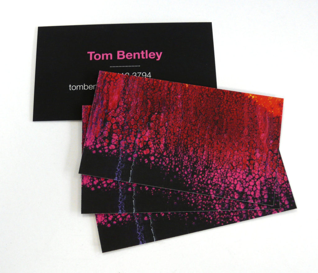
There are so many options for customizing your business cards that there’s just no excuse for handing over something bland and generic. Here’s some tips to make sure your design looks awesome:
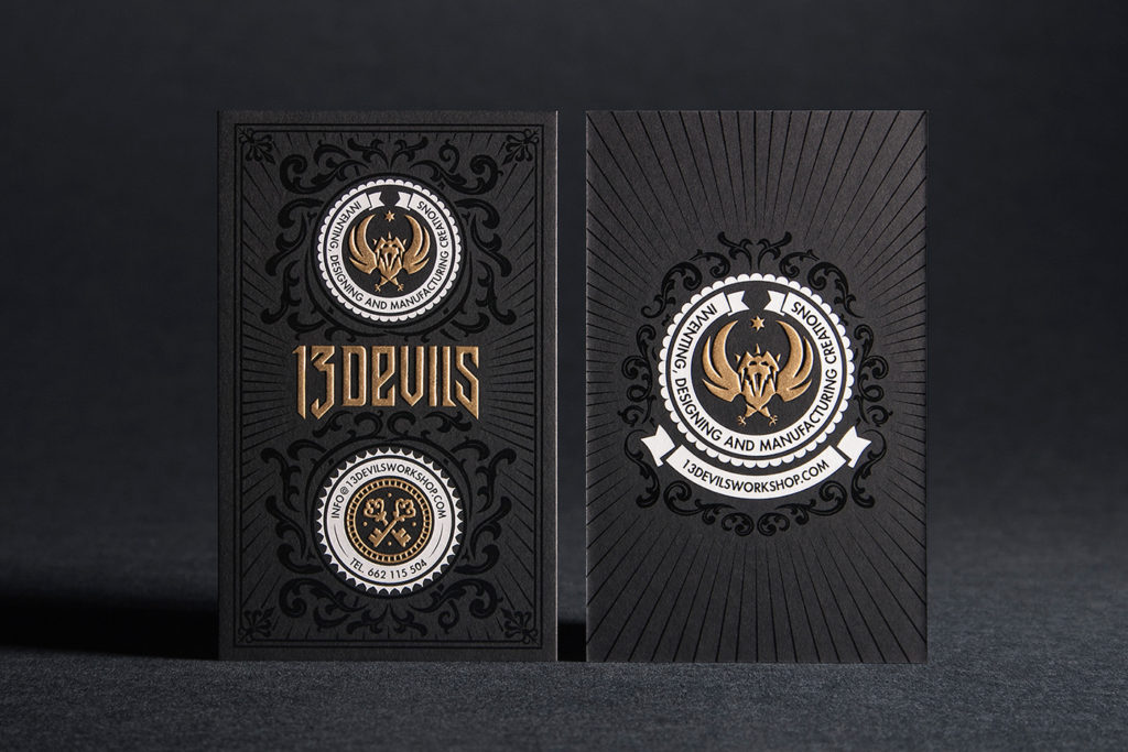
- Be consistent with your branding; your business cards, stationery, brochures, and website should all use the same 2-3 fonts and colors.
- Don’t use COMIC SANS or PAPYRUS 😀
- Try unexpected type direction or card orientation, or maybe even a custom shape
- The things that should sing the loudest are your company name, then your name, then all your contact information
- Don’t clutter up your card with excessive information or qualifications. Your card should answer the questions 1) Who Are You? 2) What do you do? 3) How can I reach you? Conversation and a brief perusal of your flyer or website can do the rest.
- Take advantage of the many customization options offered at Global:
- Rounded Corners
- Extra thickkk stock
- Plastic or Metal cards
- Embossing/Debossing
- Custom Shapes
- Spot UV coating (makes only certain areas shiny)
- Raised Spot UV coating
- Metallic Foil (any color)
- Raised Metallic Foil (Gold, Silver, Copper, or Holographic)
- Special Cutouts
- Painted Edges
- and most importantly custom design!

